Boat magazine title pages:
I was unsure how to create the title page for the publication, should I go for a more front cover effect, or more like the article titles from Boat magazine? Or should be be plain or have imagery, so I did a bit of research and refreshing into Boats title page layouts.
 |
| Simple front cover with only the logo and key aspects listed at the top. Photograph takes prominence followed by title, however would this work for the publication with a longer title? |
 |
| Title page with one wide column of text to start off the article. This encourages readers to actually read the article with the title being on the same page as part of the article. |
 |
| Really calm cover, with a square photograph above the title. This could work very simply, although looks a bit like a character profile. |
 |
| Very simple smaller title with writers and contributors below. This allows the title to be read simple and understood. This may not attract readers attention on a shelf however due to lack or content. |
 |
| Bold title with large tracking making it stretch the width of the page. This creates a strong feel and works really well with one word, not sure it would with my title. |
 |
| Much busier title page compared to those previous, incorporating part of a photograph and the start of the article. This however wouldn't be appropriate for the book front cover as the article is included. |
 |
| Title spread across two parts of the page, could work well with my publication with it having two areas and two parts to it. Could work nicely with two sets of photographs as well. |
 |
| Long description taking up much of the title page, however this gives insight into the article which is useful for those who are on the fence. |
 |
| Text fits around and on top of the photograph, which gives it less impact but allows the photograph to be larger having more impact. This could work if there was a specific photograph which would work on a larger scale for the front cover. |
 |
| Several photographs are on this title page, one larger than the other, but this could be a nice idea to make use of the duel place theme, and create almost like a patchwork effect. |
 |
| Similar to a previous title page idea, however the information bit is a lot smaller giving much more emphasis to the title which may be more appropriate. |
 |
| Single photograph in the top right corner just adds a bit of something extra to the page. |
 |
| In Boat there are several pages which use this layout for their photographs, which I find really interesting how it uses two photographs yet you can see both clearly. This could be an idea for the front cover or the about the area page, to get as much in as possible. |
Boat typefaces:
For it's titles Boat uses Freight and FreightBig, along with Soleil, both of which happen to be on Adobe TypeKit which I have access to thankfully. This makes it so much easier to use those typefaces in the publication, and such typefaces happen to be really legible as well, FreightBig being a serif typeface which helps with legibility, and Soleil is a sans serif so is clean and simple, creating an effective contrast.
Jet2 Holidays The Algarve & Madeira photographs:
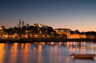
I obviously needed to include photographs in the publication, and they would ideally be taken from Jet2 itself, so I went onto the website and found photographs of The Algarve and Madeira, and was amazed by their artistic style how appealing they were, I wasn't expecting them to have such class based on the brochure itself. These photographs will then be sued in the publication to promote the area.
This refresh into the title pages of Boat magazine has been really useful to see how they use the space and to give me a better idea of how to lay out the publication.


No comments:
Post a Comment