Voyage
This was a free magazine found in Liverpool John Lennon Airport. It's interesting to see the content and layout of a free travel based magazine.
 |
| From the front cover, you wouldn't know it was free, in fact it looks like quite an aesthetically appealing magazine, where time has been taken in designing it. |
 |
| First double spread. It has advertisements in it, presumably to pay for the cost of production and distribution. The contents layout holds quite a lot of information, and teamed with the bright pink advertisement on the other page, this makes for a very busy first page. |
 |
| Much more reflecting the front cover. Clean and simple, very image based. |
 |
| Organised information into different sections, each section is clear, starting when the number starts. Nice big numbers, emphasis on beautiful typography. Carrying on the minimal, neutral colour aesthetic. |
 |
| Another double spread with advertisements. It's amazing what affect the advertisements have on the way you look at the spread, it just makes it look a lot more commercial and tacky with the contrasting advertisement against the amazing, bold photography on the other. |
 |
| Another example of listed information, again in a very organised and clear manner, with the emphasis on imagery. |
Verdict:
Voyage has some really excellent qualities to in in terms of layout, looking like a higher quality publication that it actually is, which is a real achievement. However the use of advertisements really brings the general aesthetic down and it's more recognisable as a free magazine because of these adverts. To avoid this, the advertisements should be more carefully chosen to fit in with the overall aesthetic of the publication.
Cyprien Gaillard: Dust Lines
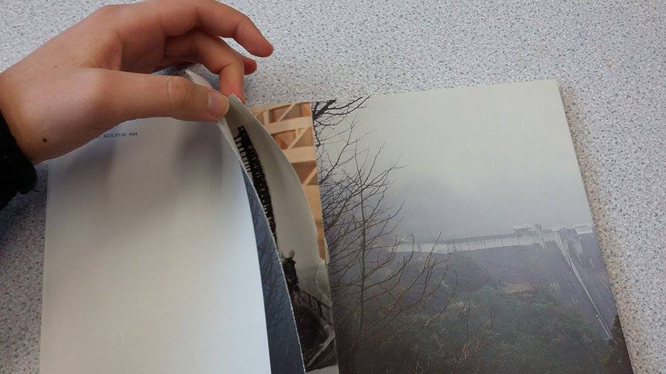
This is a zine about urban exploration, which I bought from an independant book shop called "do you read me?!" in Berlin. It has a really interesting binding method, one which I haven't figured out how to use yet, but have tried to demonstrate in the photographs below.
 |
| Front cover. |
 |
| Perfect binding, or just glued binding. |
 |
| Initial first spread, very photographic and bleak looking. |
 |
| You can see the weird folded over binding method. There's information inside that fold. |
 |
| First spread of text, it's an interview. Although there's a lot of text, there's an equal balance of photographs and text, so it doesn't look too daunting. |
 |
| Close up look at the inside of the fold. |
 |
| Another serene, but still slightly gloomy double spread. The text is still in big chunks, but this time the photograph outweighs text, so it's all in proportion. |
 |
| This spread is a little more busy, with more photographs in it and more interesting text, especially at the bottom. This goes a bit away from the bleak, minimalist appearance. |
 |
| Back of the publication. |
Addition:
In the process of writing this blog post I figured out how the binding method worked, and it's safe to say I have made a bit of a mess of this zine.
How it doesn't work:
By peeling away on side from the spine so it folds out, and then peeling down another side so it folds down.
How it does work:
By cutting down the folds in the paper, to release the individual pages.
Verdict:
This is a really interesting publication, with a completely unique binding method, which could be a fun way for people to interact with the publication, find hidden things. The layout, although minimal and stripped back in most spreads, it is a little too bleak for the publication I'll be producing, however, I will be taking the binding method forwards into experimentation, as this is something really unique and interactive.
Boat
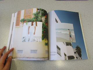
Boat is a music, life, food and technology magazine, which has a very high quality aesthetic to it. I chose to research it as this issue features Tel Aviv, Israel, and some interesting photography from that city. It showcases these photographs and information in a really contemporary and clear manner, which would be useful to use as a framework for my own publication.
 |
| Front cover. A velvet stock was used, giving it a very luxurious feel, one that was very pleasing to touch. The colours are very striking and contrasting, giving it impact on the shelf. |
 |
| Example article title spread, clean and simple, with nice space giving it room to breathe. |
 |
| Composition of text and images, the focus being on the one main image, which your eyes are drawn to first. |
 |
| Example of a more text heavy double spread. |
 |
| Beautiful, minimalist article title spread, the image speaks for itself, the text only there to give the defining insight. |
 |
| Multi-imagery and text spread. This could be an ideal spread for my publication, as it combines several images with a good amount of text, whilst still appearing clean and refreshing. |
 |
| Photograph only spread, which gives you more of an insight into it's relating article. Perhaps this is something to be considered for my publication, to give a refresher from the text. |
 |
| Innovative use of photography, using a related photograph as the frame for another, creating a collage effect. |
Verdict:
Boat has much more of the high quality appearance that I think will be aiming for in my publication. It includes a great deal of text, whilst still making the photographs the main focus mainly throughout. This is something important for my publication, to make the photographs as vibrant and focal as possible, whilst still including all the necessary accompanying text.
Lagom
Lagom is a similar publication to Boat. It has a similar high quality cover, with a foiled title, giving it a shiny, dynamic appearance. This publication could also prove to be one which I use the layouts for for my own publication.
 |
| Front cover, foiled lettering, vibrant photography from key articles featured on the front. The name of each article included is in the bottom left corner, so people know what's inside without opening it. This could be a useful idea to give people a bit of insight, however might it be better a surprise? |
 |
| Theme title page. Interesting use of a large & to join the two words together, and almost act as an object alongside the photograph. |
 |
| Example title page. The article title and caption sit within a photograph, which doesn't make them as clear as they could be, however this does allow for a full bleed photograph which makes for a full of colour title page. |
 |
| In this article, the text takes centre stage, with the photos being accompanying features. This is an incredibly simple layout, and makes for a simple, clear read. |
 |
| Example of multiple images in a spread. This layout works really simply and effectively, even though 8 photographs are in this spread, and is therefore one to consider for my publication when multiple images are needed. |
 |
| At a glance, summary of key information. This is done very simply and with a precise structure, a great kay of putting all the key information together, without making a table or some sort of chart to hold it. |
 |
| Inside this publication was a little mini one, with all the key things you'll need to know about visiting hong Kong. Almost like a checklist or how to guide. This could be something different to include in my publication, smaller pages inside which can maybe be ripped out with key information on. |
 |
| Very striking article title page, the same as a previous article title spread, however with a much simple photograph behind the title, which makes the title have much more impact. This shows that I should take great care when choosing photographs that will have text sitting on them, to ensure the text doesn't get lost. |
 |
| Example of a high impact photograph page, to give a break from the text perhaps, or to highlight a particularly striking photograph. |
 |
| Example of a layout which uses several larger photographs and accompanying text. This spread does look a little cluttered, due to there not really being much of a grid system in place, or that can be seen, in regards to the imagery. |
 |
| This would be my favourite spread. The colours of all the photographs give off a certain kind of sparkle, with the green making it very natural and adding rich tones to the spread. The is also a decent amount of text as well, as well as blank space to balance everything out. |
Verdict:
Lagom has some very interesting and impactful title pages, and the use of the in book booklet is a really great idea, one that can be implemented into my own publication easily and to great affect. There is however a mixture of effectiveness of the content pages, some clear and structured, and others looking slightly jumbled.
Overall:
Based on this research I should take into consideration areas to include advertisements in my publication as it will be free as travel brochures are, and I'll have to fund this somehow. I really want to experiment with Dust Lines binding method, as this could be something unique and interesting, and give my publication the uniqueness it needs to stand out and be recognised. The content page layouts will most likely be taken from Boat magazine, as these had great structure to them whilst also showing a variety of layouts and sizes and numbers of imagery as well. The title pages may be taken from Lagom magazine, as these had great impact and created a strong and clear start to an article. I may also experiment with the booklet within a publication idea Lagom uses, as this could be really useful for people to tear off key bits of information or things that they find interesting to save for later.


No comments:
Post a Comment