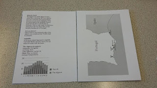
I produced a mock up of the condensed version of the brochure, which will be the one I eventually print. I produced a mock up to see how the page layout works in practice, and whether the text size was alright, and how the spreads looked together, as well as whether the photographs printed off in good as to be expected in black and white quality.
 |
| Front cover. Everything looks in order. |
 |
| First spread, a clean, crisp opening to the brochure. |
 |
| Madeira map spread. Again the same problem occurred as with the Algarve spread, with the map looking far too small. |
Initial notes for improvement:
After first looking at the brochure mock up I wrote down all the things I immediately wanted to change, so that I didn't have time to ponder over whether some were the right decision or not, and forgetting about some others.
- Area name on right page in the right corner
- Outline of full star on half stars, same as with TripAdvisor circles
- 7 nights from... and board type bigger type size
- General body copy text for the hotels larger type size
- Instagram feed last month... text further down
- Instagram feed have you been to... text slightly higher up
- Maps landscape on the page, so they will the page
- Maybe condense the place information down to one page - second spread looks too empty, maybe change if map was rotated though
Feedback:
I showed the mock up with the map editions made to some peers, and asked them about the body copy text size mainly, to see whether I needed to make it smaller. Their responses were that the text size was fine, and I shouldn't make it any smaller because then it may not be as easily read by older people, or people with bad eyesight. I also asked about the screen printed pattern on the inside folded sides of the pages, to give it something extra. They responded that the pattern would give it that something extra, but it wasn't necessary and I should only do it if I have enough time. I asked if without the pattern then the fold would be for nothing, but they responded that the fold still makes the stock appear thicker and of a higher quality with this fold, and that it would make it easier to flip the pages as well, so it would still have reasoning.
Progression:
My next stages will be to make the additional changes that I listed previously, and to start work on a pattern for the inside folded sides to give it that something extra.


No comments:
Post a Comment