Following on from the initial research into Boat's title pages, I used these as a guide for my own publication.
 |
| Simple text only. Does create a classy effect however Jet2 isn't a massively classy company and with no imagery it doesn't really draw you in. |
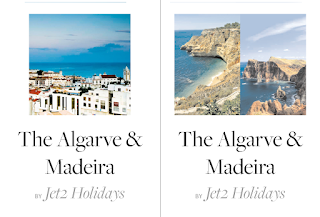 |
| Left shows a simple square framed photograph giving a well rounded appearance of Madeira and the Algarve. Think this creates a very balanced appearance and the photograph definitely draws you in. On the right I tried to show Madeira and The Algarve as two separate places, which they are, however the photographs don;t fit well together and I couldn't find one for Madeira that worked with The Algarve, and it just looks quite unprofessional the dual photograph idea. |
 |
| Left shows a different take on the two photograph idea, which has a more abstract approach. However it does look a bit like a balancing act, and there's no real structure to it. On the right I went for a long strip photograph, clean and simple, although it brings the focus down to Jet2 Holidays and leaves The Algarve & Madeira hanging uncomfortably. |
 |
| Left shows another take on the two photo idea, however trying to put more emphasis on the title, which it achieves really well, with the photographs framing it, however it now looks a little stripy. On the right is using the same lower photograph as the left but a bit closer to the main title, putting emphasis on it but still allowing for space. However it it quite close to the title and looks imbalanced because of this. |
 |
| Further development of the last layout in these two designs. The left is an adaptation of the first photograph including layout, only using a wider frame, which fits the shape of the original photo much better. This has a great balance and works nicely how the edges of the photograph are in line (or near enough) to the edges of the text. On the right is a similar version only with the photograph at the bottom. Although this doesn't place as much emphasis on the title as your eyes go straight over the title and onto the photograph. |
This development has been really useful to see what works and what doesn't, and to give an idea of how the rest of the publication is going to follow. I will be using either the 3rd layout or the second to last layout, as these were the most balanced and simplistic, yet showed The Algarve & Madeira off in the best ways possible.


No comments:
Post a Comment